I have utilised my own brand as an example of my work and to provide a sample brand guideline.
I setup a private password protected page for my clients where they can view the design process and collaborate, this private page can be shared with any relevant parties. Also at the completion of the design project this private page will act as a distribution portal for all design collateral making it easy for your print provider etc.


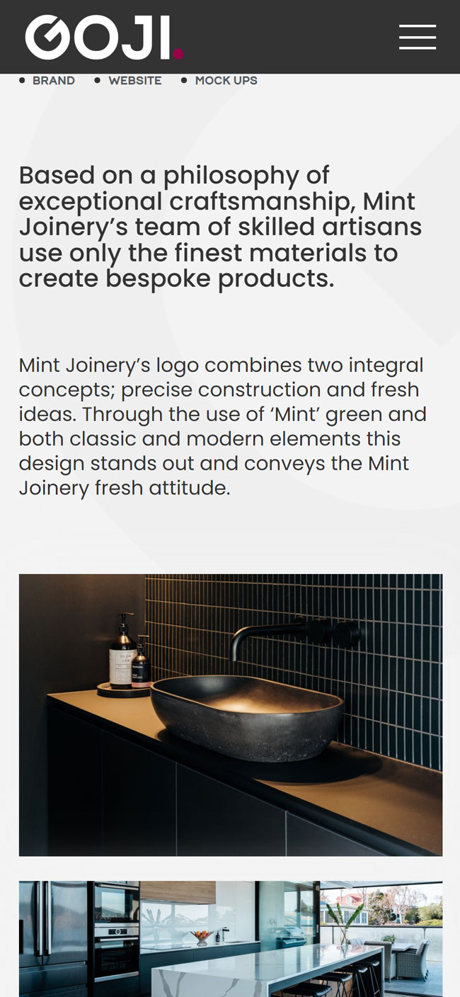
Website design for me, well your looking at it.
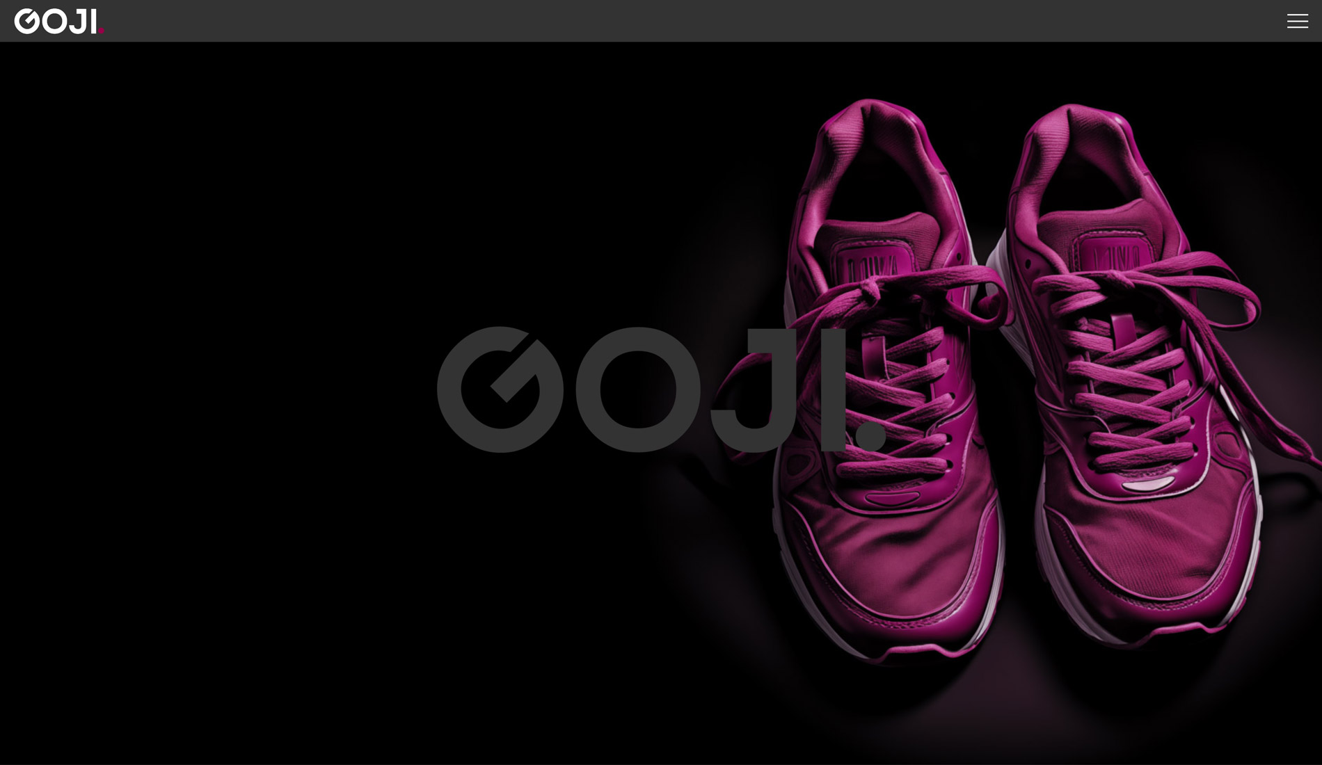
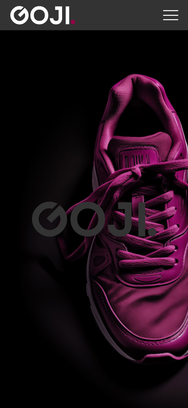
The Goji concept originated from a pair of my daughters gym shoes that are ‘goji berry’ in colour. I designed and developed this website to show multiple branding concepts and a wide scope design layouts and ideas.

Using a strong font in combination with a lighter weight font can greatly enhance the professional and polished look of a logo design. By working with varying densities of font, a designer can create a visual hierarchy within the logo that adds dimension and depth to the overall composition. The strong font contributes to a bold and commanding presence, while the lighter weight font softens the edges and supports a subtle elegance. This approach can effectively communicate the desired tone and personality of the brand through the typography alone.
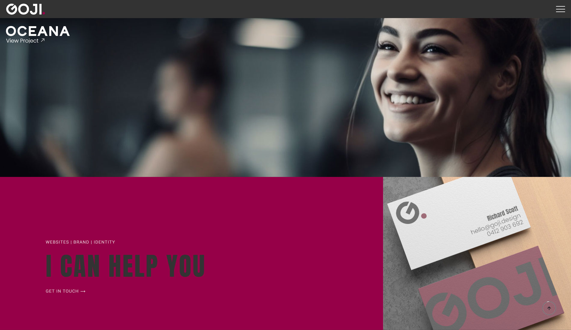
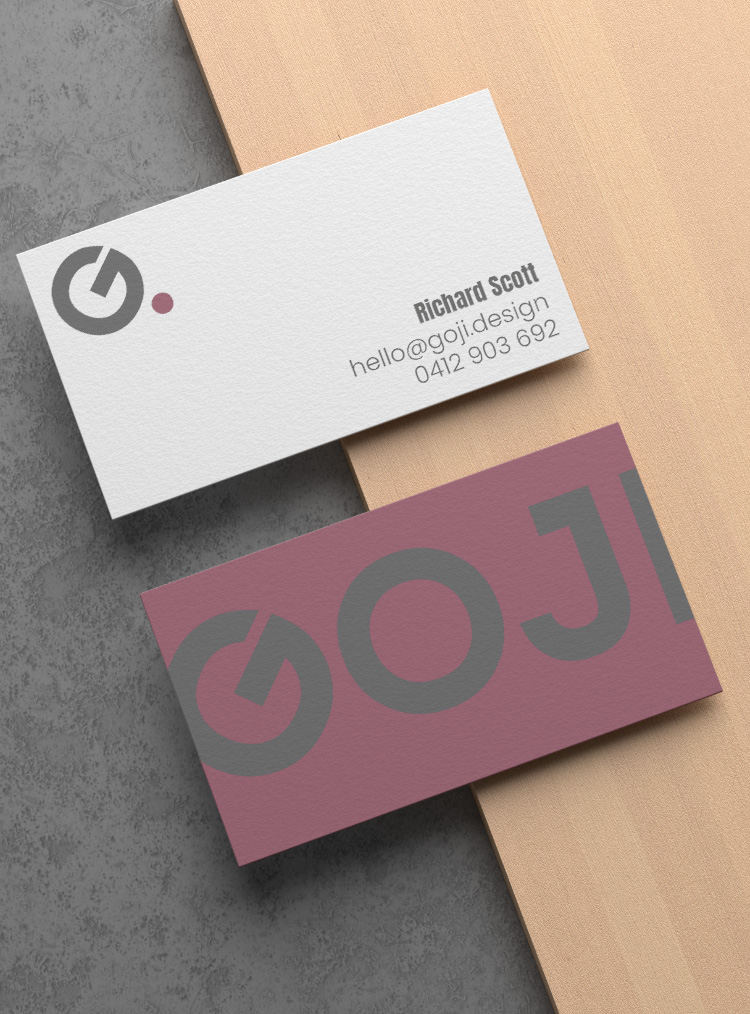
As part of the brand guidelines I produce mockups of use scenarios related to the individual business
By showcasing the brand elements in a usage mockup the client can visualise how the design comes together in real world applications, it is also useful for the printing providers as a layout guide.
Take a look at an example of the online brand guideline here. This online guideline is provided for all clients as a collaboration tool during the design process, it is also a collateral sharing platform to allow easy distribution digital files for print or web use.
© Goji.design 2024
